Earth and blue tones differentiate high-heeled sandals

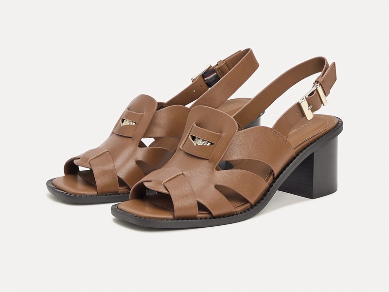
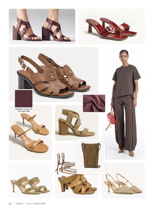
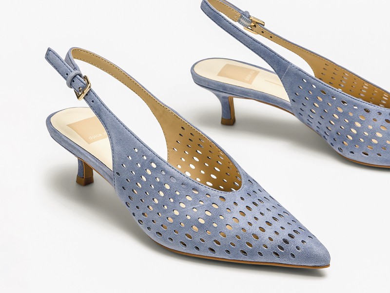
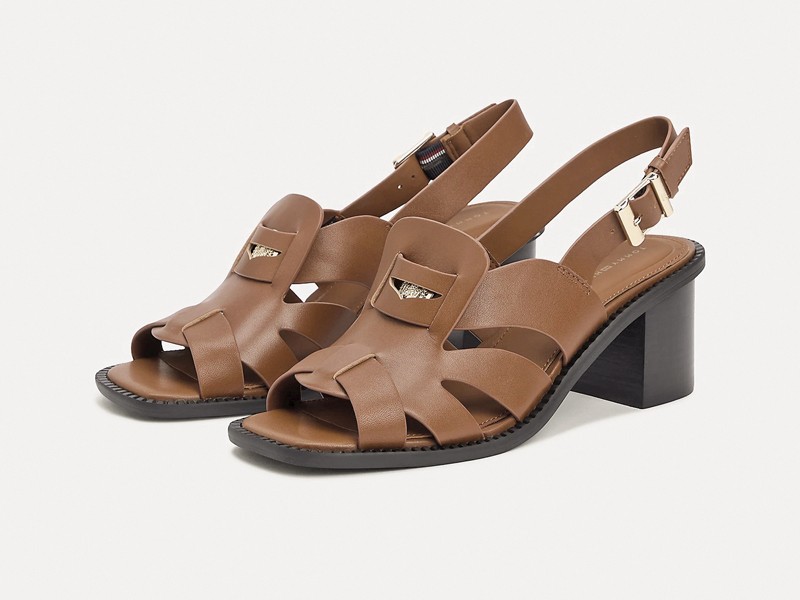
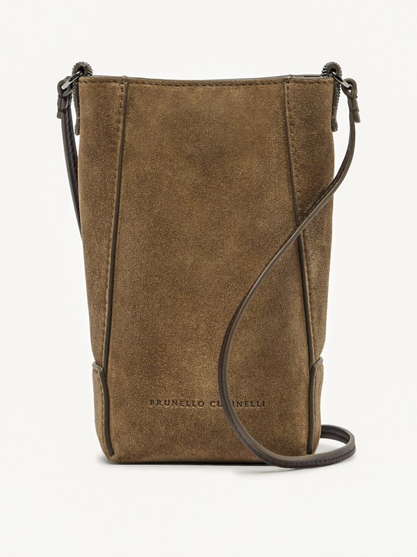
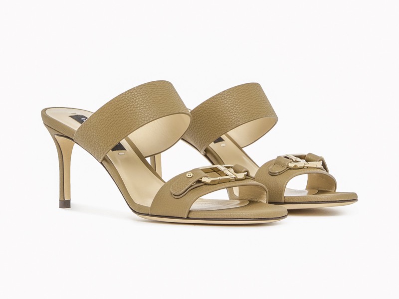
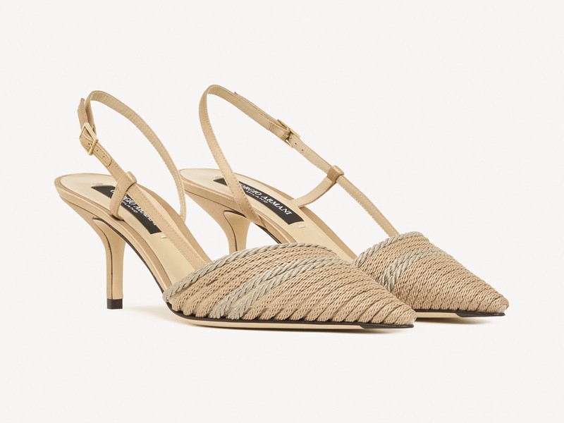
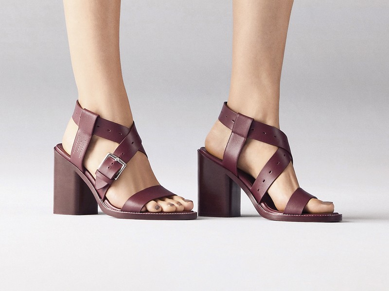
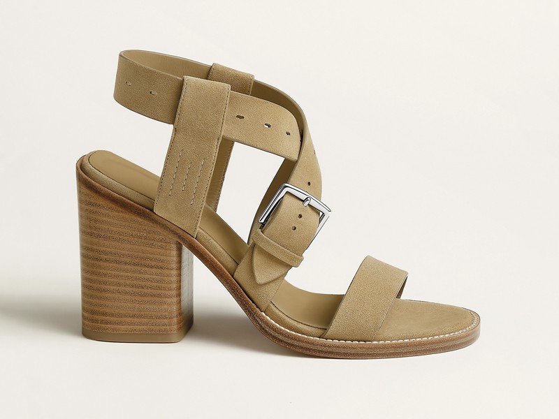
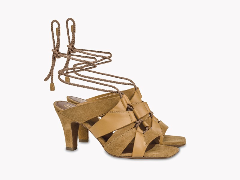
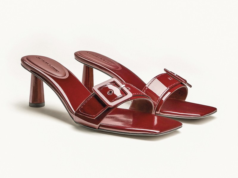
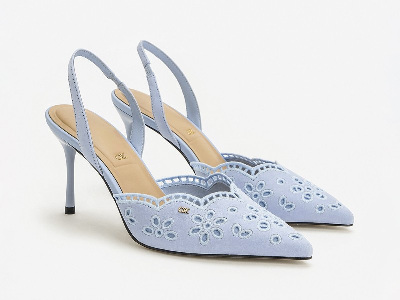
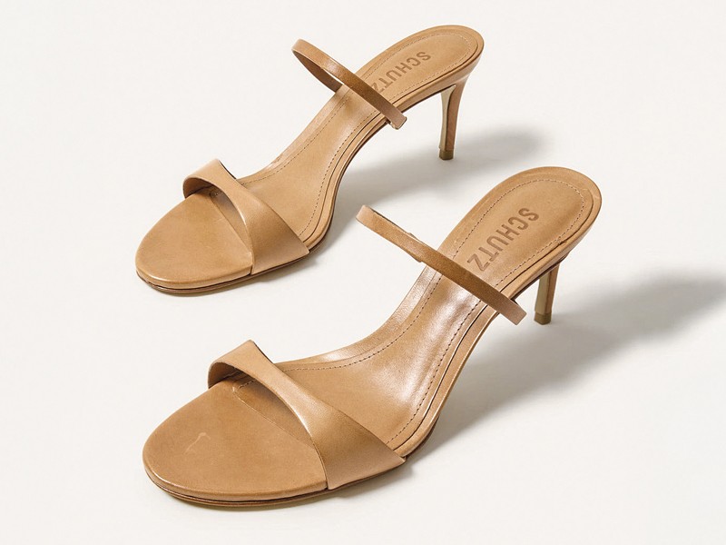
The earth family moves through deep browns, caramel, camel, beige, muted olive and shades close to gold. Pantone 19-1526 TCX Chocolate Truffle provides the darkest reference within this group and supports continuity with mid and light tones. Variation does not require one silhouette: it appears on wrapping uppers, crossed bands, minimal straps, pointed slingbacks and open mule formats.
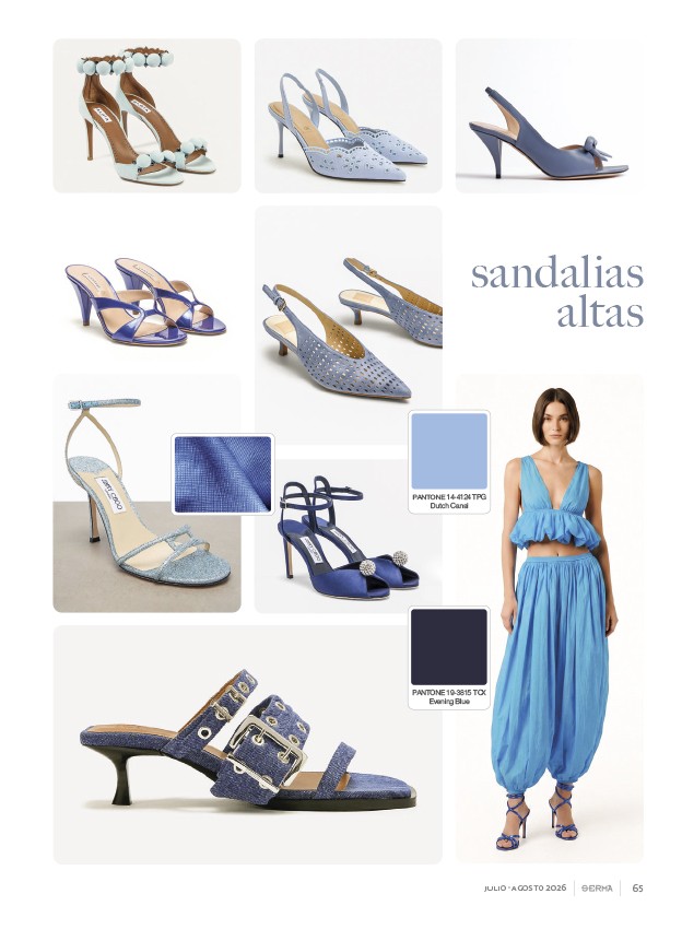
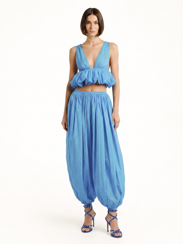
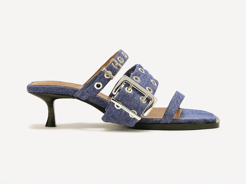
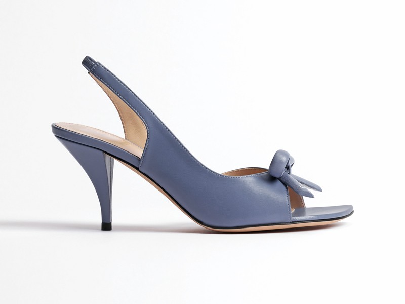
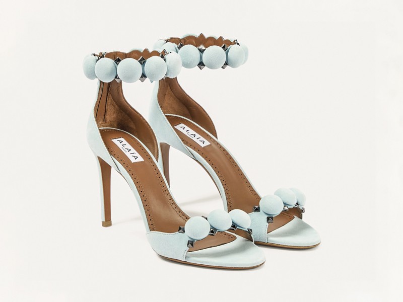
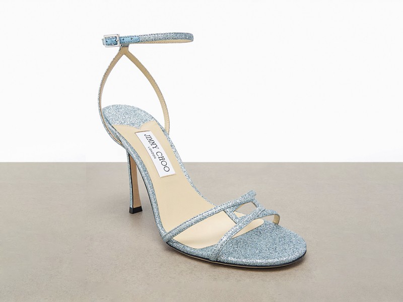
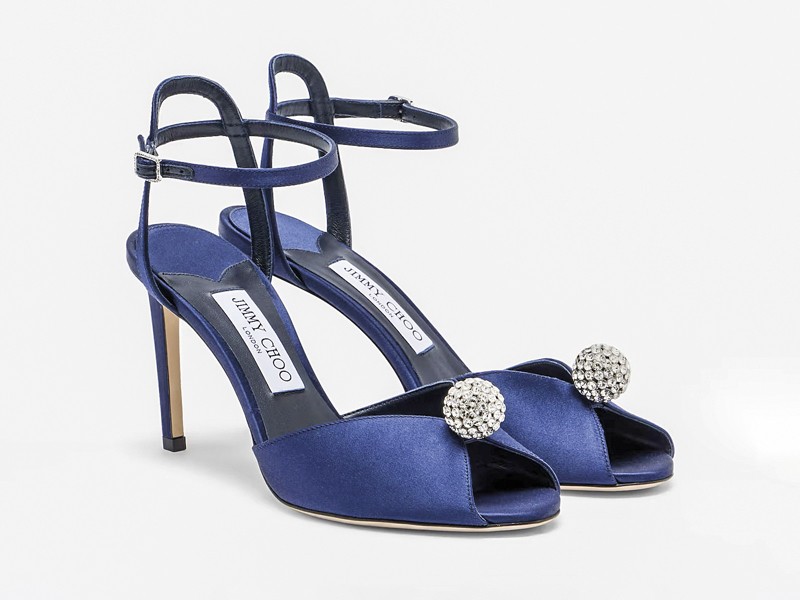
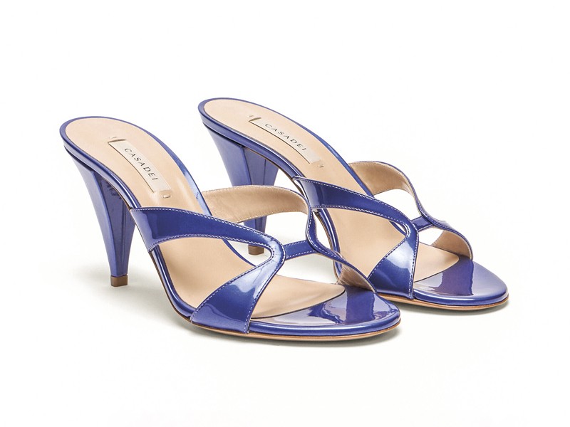
The blue family covers a range from light blue to deep navy. Pantone 14-4124 TPG Dutch Canal marks the lighter end, while Pantone 19-3815 TCX Evening Blue establishes a dark reference. Mid blues, violet-leaning shades and bright-looking versions sit between them. Changes in value alter the visual weight of straps: lighter tones emphasize outlines and ornaments, while darker ones unify surfaces and reinforce product continuity. Moving between the two poles creates intermediate options that can coordinate straps, ornaments and visible bottom elements without making every component identical. This keeps the color family legible while allowing each style to retain its own construction.
The same color family takes on different readings according to surface appearance. Earth tones include smooth areas, soft shine, woven-looking pieces and sections that appear velvety or metallic. Across the blues, smooth, satin-like, sparkling, perforated and denim-looking finishes can be distinguished. These differences broaden the assortment without relying only on the addition of more colors.
The comparison must remain visual when no technical specification is available. A textile-looking surface does not confirm that it is woven; metallic shine does not identify composition or process; a denim-like texture does not prove which fiber was used. For development and sourcing, the supplier should declare material, finishing technique, color reference and any tested performance. A physical sample remains necessary to assess how the shade responds on the actual surface and under the lighting conditions defined by each company.
The specific opportunity for surface-material suppliers, color and finishing services, upper developers and manufacturers is to present each proposal as a system. A sheet can bring together the color reference, approved sample, declared composition, confirmed process, batch or internal identification, application piece and finished-product photograph. It may also state which elements share a shade —upper, straps, heel, visible footbed or sole unit— and which ones work in contrast.
For manufacturers and brands, this documentation makes it possible to organize the assortment into two color capsules without repeating the same morphology. Earth tones can group restrained, woven-looking or softly reflective options; blues can alternate light, mid and deep versions with different degrees of ornamentation. The commercial criterion is not to assign use or performance to a color, but to make samples, components and finished products easier to compare for sourcing, collection development and customer presentations.
Suppliers of surfaces, color developments, uppers and finishes, together with high-heeled sandal manufacturers, can present color cards, verified specifications, samples and applications through SERMA.NET and SERMA's digital catalog. Comparing earth and blue tones also provides a strong visual resource for Instagram @serma_net and Facebook SERMA, including collaborative posts that show the progression from sample to finished product.
Contact: marketing@serma.net | WhatsApp: +54 9 351 394 8656